What if the most powerful part of a design is the part you don’t actually see? In art, design, and photography, empty space isn’t nothing. It’s called negative space. In this article, we’ll explore why it matters, how artists and designers have used it, and how it can change the way we see the world around us.
What is Negative Space?
So what exactly is negative space? In simple terms, it is the empty area around and between the subject of an image. The subject itself is called positive space—the figure, object, or main element. Everything that surrounds it, the unused space, is the negative space.
Negative space is not just background. It plays an active role in composition by defining the subject, creating balance, and giving the viewer’s eyes room to rest. Without it, artworks and designs can feel crowded, flat, or overwhelming. Used thoughtfully, empty space can also guide attention to the subject, making it stand out more clearly. This is why minimalist designs, although they appear simple, often feel deliberate and striking.
Why Negative Space Matters in Art and Design
Understanding what negative space is is just the first step. The real question is, why does it matter so much?
First, it creates balance and harmony.
Negative space works like a counterweight to the subject. It keeps the composition from tipping too much to one side and gives the whole piece a sense of stability.
Second, it helps direct attention.
By surrounding the subject with emptiness, the viewer’s eyes are guided exactly where the artist or designer wants them to look.
And finally, negative space can carry hidden meaning.
Some of the most clever designs use the empty areas to form shapes or symbols. In the Guild of Food Writers logo, the shape of a pen nib also contains a spoon in the negative space. It is a smart and concise visual metaphor. It communicates that the members of the Guild are not just writers, but writers who are deeply connected to the world of food.
Another example is the Spartan Golf Club logo. At first you see a golfer swinging a club, but the shape also forms the outline of a Spartan helmet. Not only does it represent the sport of golf, it also conveys strength and precision through the Spartan imagery. These designs show how space can be used not only for balance, but also to tell a deeper story.
Beyond logos, negative space also appears in optical illusions. One of the most famous is the Rubin Vase. If you look at the black area, you see two faces in profile. If you shift your attention to the white area, it suddenly becomes a vase. This shows how negative and positive space can actually switch roles depending on how we perceive them. It reminds us that empty space is never just the background. It is part of the design itself.

Rubin Vase, c. 1915, by Edgar Rubin.
Negative Space in Asian and Western Art
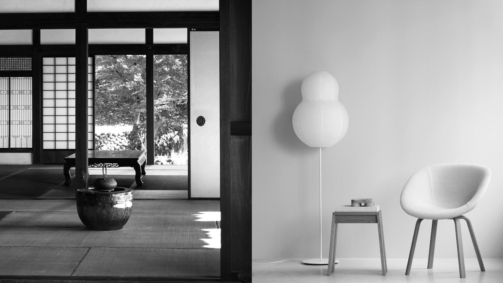
Powerful uses of negative space can be found not only in modern design, but also throughout the history of art across cultures. Artists have been working with it for centuries, often in ways that feel subtle yet deeply meaningful. This idea is not limited to Western traditions. It also plays a central role in Asian art.
In Japanese ink painting, vast areas of blank paper are deliberately left untouched. The emptiness is not accidental; it gives the brushstrokes their vitality and presence. This reflects the concept of Yohaku no Bi, the “beauty of blank space,” where what remains unpainted carries as much meaning as the ink itself.
In Western art, similar ideas emerge. Henri Matisse, for instance, used negative space extensively in his paper cut-outs. The bold, colorful forms gain their impact because they are set against broad areas of emptiness. At times, Matisse incorporated both the positive cut-out shape and the leftover negative shape into the same composition, treating them as equal parts of a whole. For him, the surrounding space was never just background. It had its own form and expressive quality. Positive and negative space defined each other.
Famous Examples of Negative Space in Graphic Design
Some of the most clever and memorable designs owe their impact to negative space. It is what makes certain logos, posters, and layouts stand out at first glance.
In graphic design, Saul Bass used negative space to craft some of the most iconic movie posters of the twentieth century. In Anatomy of a Murder, the fragmented silhouette of a body is formed from flat shapes, and it is the negative space between them that allows us to recognize the figure. The simplicity makes the image both striking and unsettling, perfectly matching the tone of the film.

Poster for Anatomy of a Murder (1959), designed by Saul Bass.
Another influential figure is Shigeo Fukuda, one of Japan’s leading post-war graphic designers. He became renowned for his ingenious use of negative space. Many of his posters contain hidden images that only emerge once you notice the surrounding emptiness. His work demonstrates that what appears empty can carry the strongest meaning.
Beyond posters and logos, negative space plays a crucial role in modern digital design. In minimalist posters, wide areas of emptiness make a single word or image stand out with greater force. On websites and apps, blank space ensures that text remains readable and navigation feels intuitive. Without that breathing room, digital experiences quickly become cluttered and overwhelming.
These examples show that negative space is never wasted. It is an active design element that adds clarity, elegance, and at times, hidden meaning.
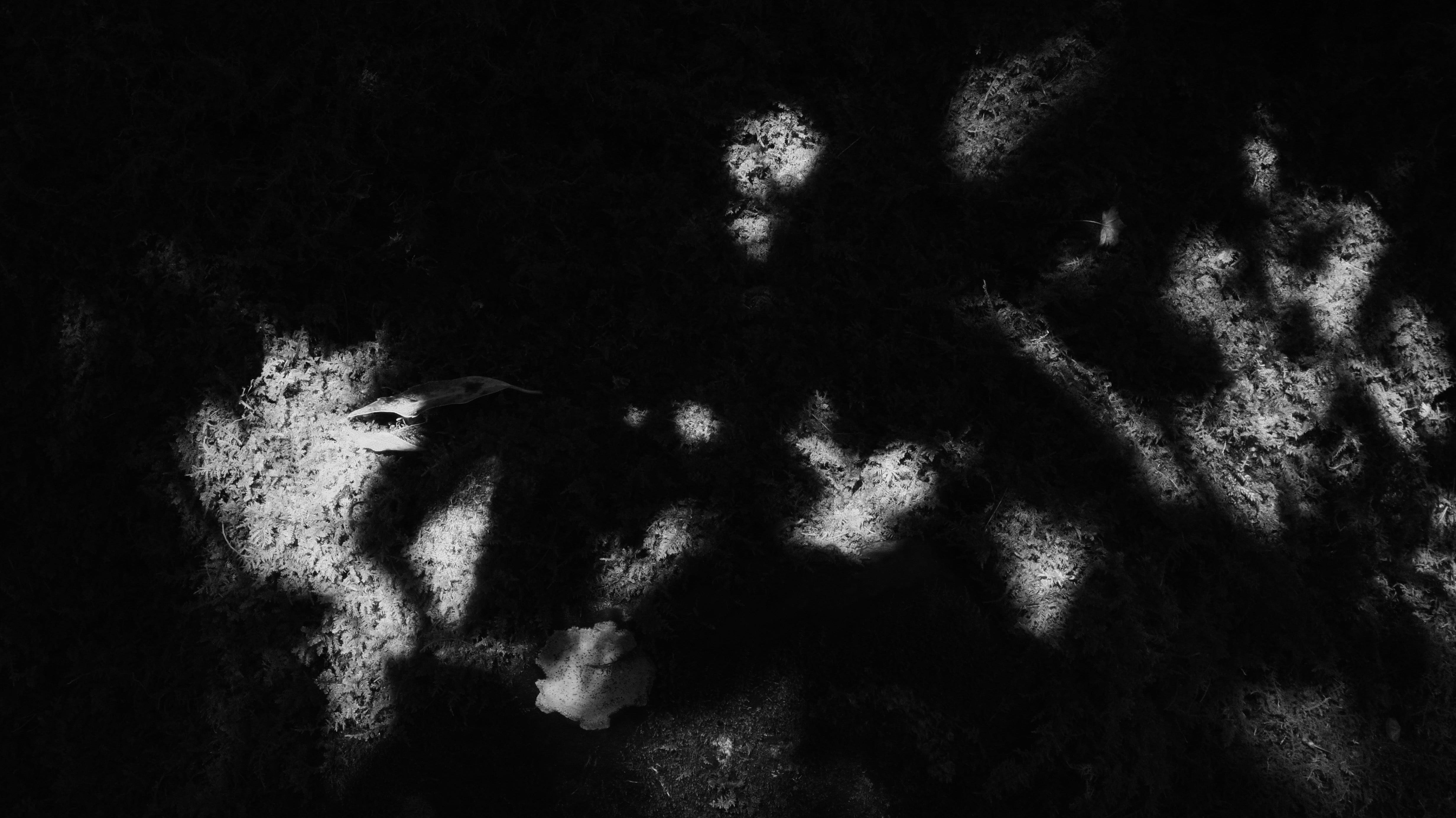
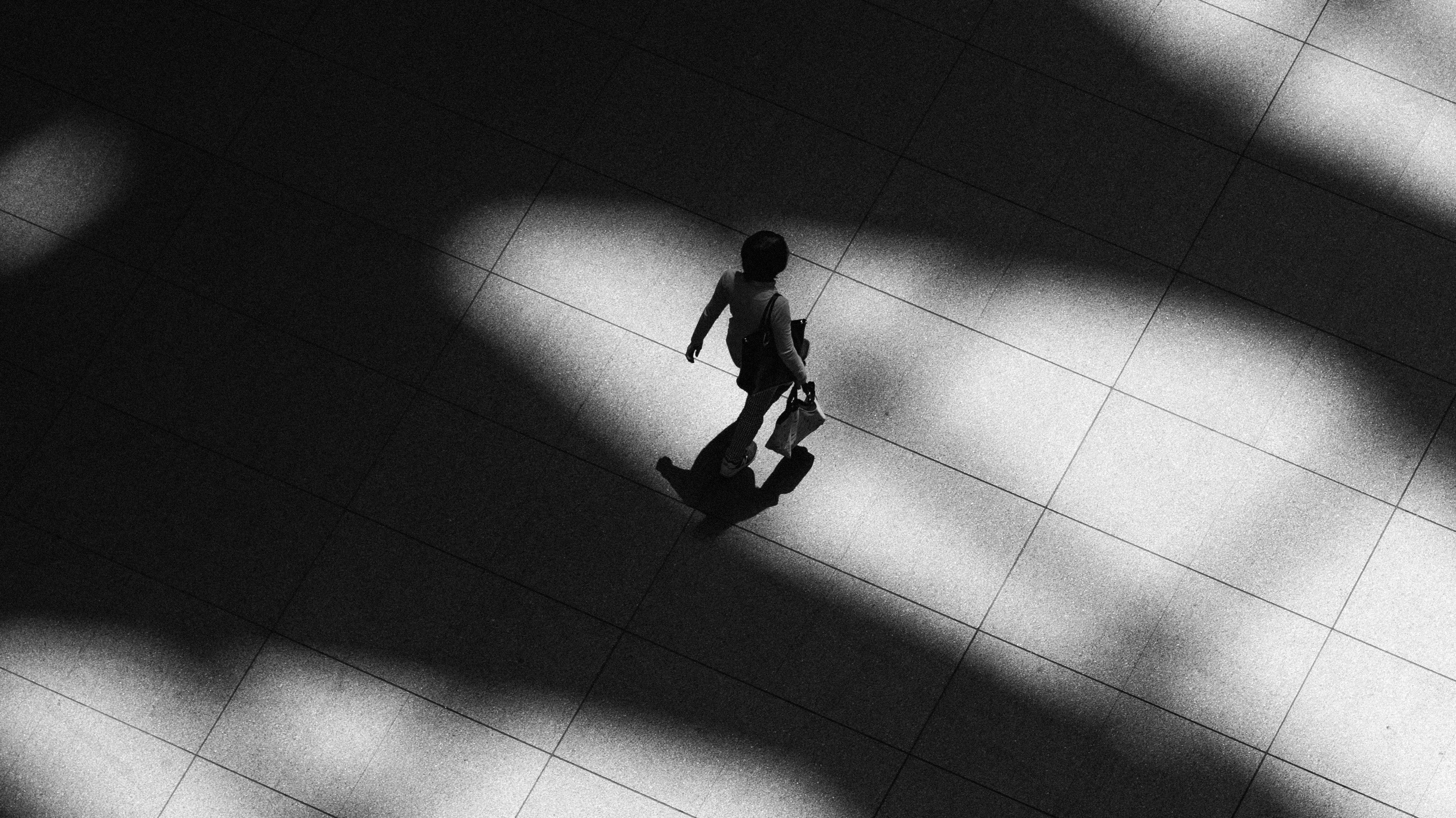
Negative Space in Photography: Creating Mood, Scale, and Focus
Negative space also plays a vital role in photography. A subject surrounded by emptiness often feels more striking and emotional. Imagine a bird against a wide open sky or a solitary figure in a vast landscape. The surrounding space is not wasted; it directs attention to the subject while also setting the mood.
Photographers use negative space to suggest calm, solitude, or tension. By giving the subject room to breathe, an image becomes simpler yet more powerful. When applied creatively, negative space can heighten emotion, reveal a sense of scale, or even create surprising illusions.
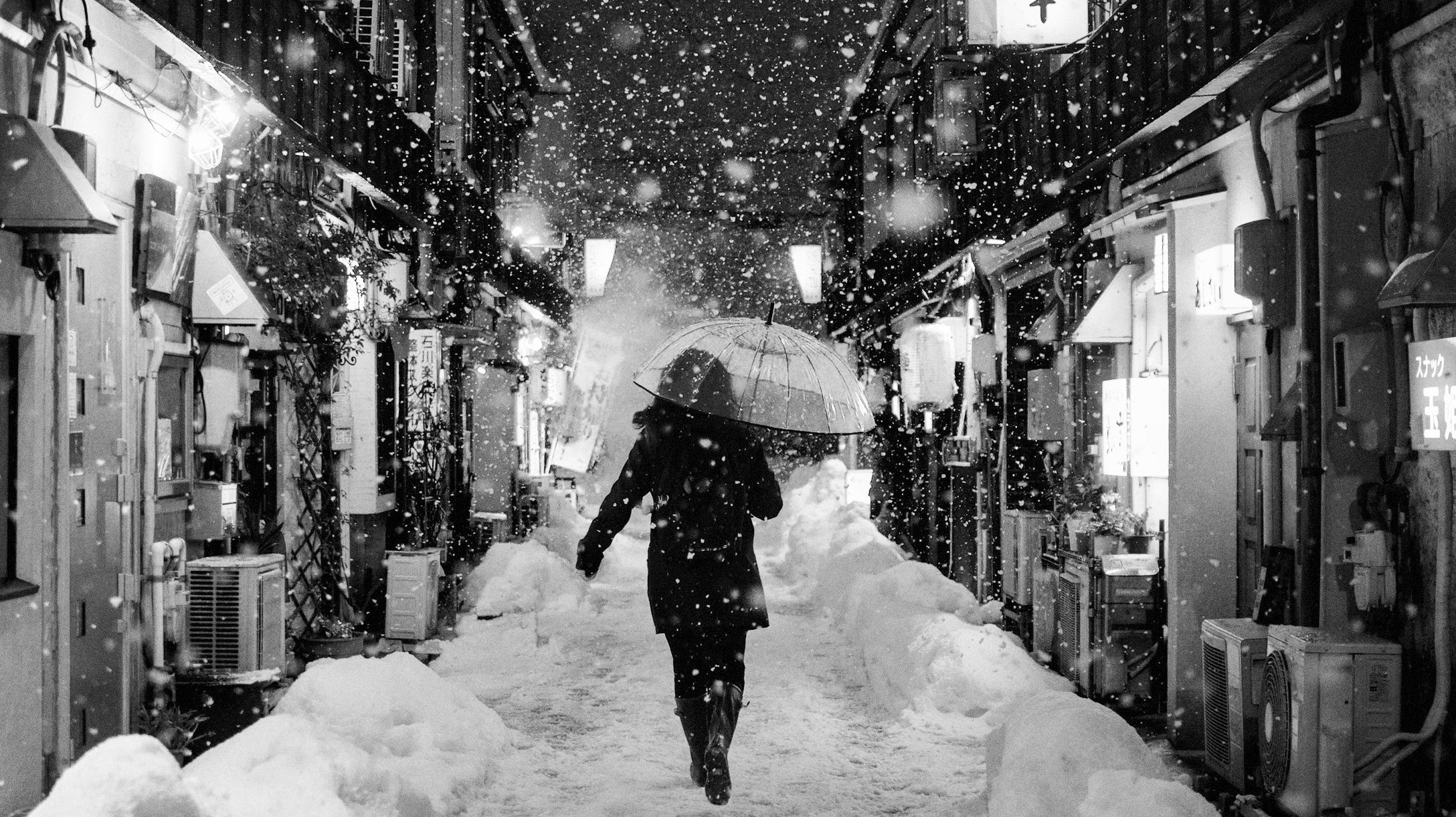
The Japanese photographer Shoji Ueda offers a remarkable example. Working in the Tottori sand dunes, he often placed his subjects against endless expanses of sand and sky. These open areas became negative space, isolating the figures and giving them a surreal, stage-like presence.

Photo by Shōji Ueda, via Wikimedia Commons (Public Domain).
Unlike in commercial design, where negative space sharpens communication, Ueda used it to evoke ambiguity, dreaminess, and quiet tension. The emptiness feels both playful and haunting, extending beyond clarity into atmosphere. This approach also reflects the Japanese aesthetic of Ma, where pauses and stillness give greater weight to what is present. Ueda’s work reminds us that space is not a void, but a medium of emotion.
Why Empty Space Is Never Just Background
Negative space may seem like a simple design principle, but it creates balance, directs attention, and carries hidden meaning. From paintings and posters to photography, artists and designers across cultures have relied on it to shape how we see and feel.
This idea also connects with Ma, the Japanese concept of space and interval. Both remind us that what surrounds the subject is never just background. While Ma reflects the rhythm of space in life and culture, negative space functions as a practical tool in art and design.
Together, they point to a larger truth: what we leave empty can be just as meaningful as what we choose to fill.
Read More Design Articles:
• 7 Japanese Zen Aesthetic Principles That Define Wabi Sabi
• The Secret Meaning Behind Japanese Summer Colors
• 8 Japanese Aesthetics That Might Change How You See Beauty
• Ma: The Japanese Aesthetic of Negative Space and Time