What defines beauty in Japanese culture isn’t always obvious. Beneath the surface lies a deeper layer—a quiet philosophy that shapes how beauty is seen, felt, and lived.
Japanese architect and designer Masayuki Kurokawa proposed a unique way to understand this sensibility: eight aesthetic consciousnesses that capture the essence of Japanese aesthetics.
This article explores each one, from the space between things to the quiet power of what remains unseen. These concepts might just change the way you see beauty.
微 (Bi) — The Aesthetic of Subtlety
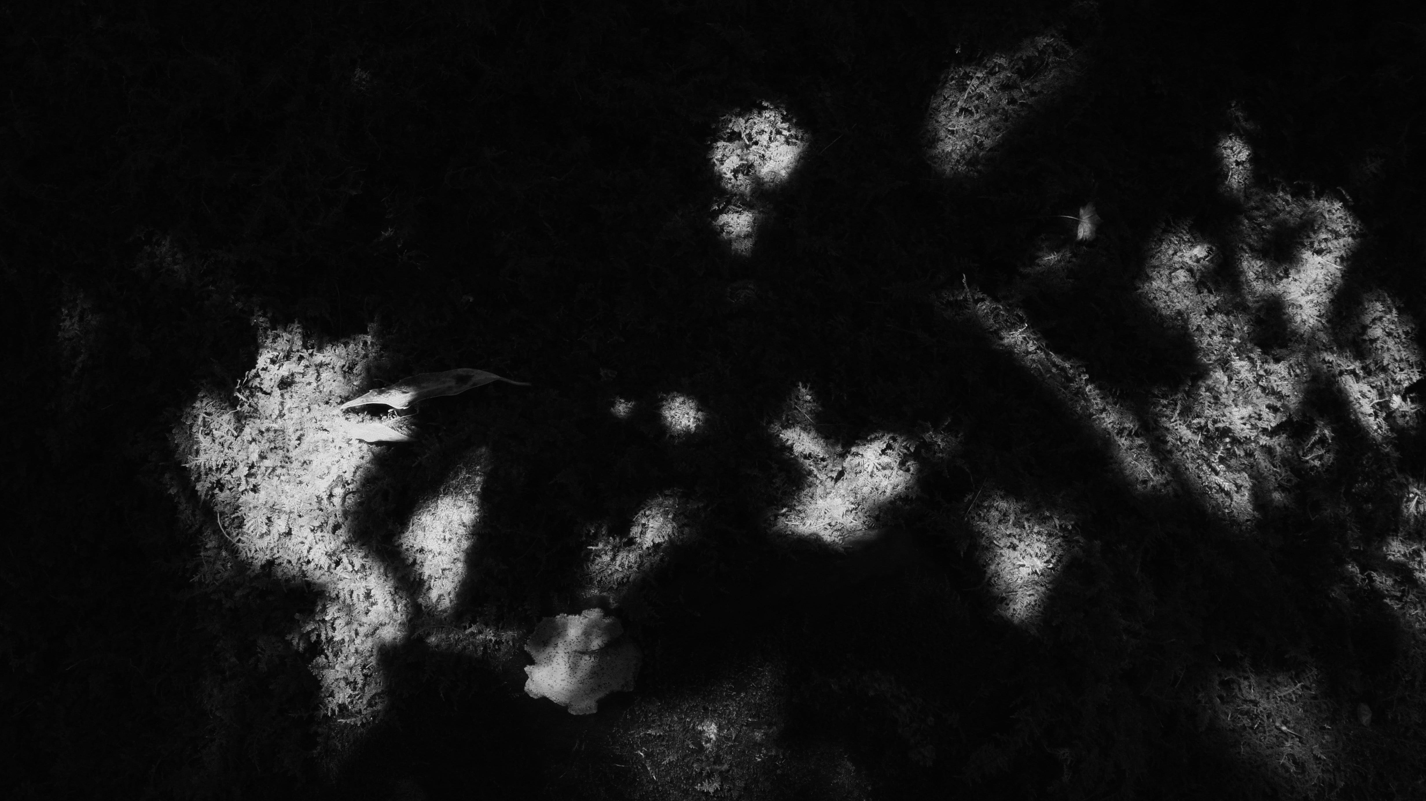
The character 微 (Bi) means "subtle," "delicate," or "faint."
In the context of Japanese aesthetics, 微 (Bi) conveys a heightened sensitivity to elements that are barely perceptible—the quiet, nearly invisible details that often go unnoticed unless one deliberately slows down and pays close attention.
This form of beauty does not announce itself. Rather, it resides in the background: in the spaces between things, in fleeting impressions, or in the texture of a surface.
It is the feeling evoked by the fading sound of a temple bell, the soft shadow cast by a paper screen, or a brushstroke left intentionally imperfect.
Masayuki Kurokawa notes that this idea is encapsulated in a Japanese expression: "Sacredness lives in subtlety" (神は細部に宿る).
In Japanese culture, it is believed that the soul of the creator is not revealed through grand gestures but through the smallest, most refined, and restrained touches—what is almost unspoken.
This sensibility is evident in everything from traditional architecture to the design of ordinary objects.
微 (Bi) reminds us that true beauty is not always immediately visible.
It is often only by slowing down, quieting the mind, and observing closely that we begin to perceive what is genuinely there.
並 (Hei) — The Beauty of Coexistence
The character 並 (Hei) means "side by side" or "in parallel."
In Japanese aesthetics, 並 (Hei) reflects a cultural disposition to allow multiple elements—even those that appear contradictory—to coexist without conflict.
This mindset is evident throughout Japanese life. Christian churches and Buddhist temples may be found in the same neighborhoods. The Japanese writing system seamlessly combines kanji, hiragana, and katakana, each serving a distinct function, yet all working together in harmony.
Rather than insisting on a single correct way, 並 (Hei) values coexistence, balance, and inclusion without hierarchy.
This sensibility extends to everyday practices. At the dinner table in many Japanese homes or traditional settings, each person may use different tableware—not due to status differences, but simply as a reflection of individual preference. One person may favor a shallow bowl, another a deep one. There is no pressure to conform; instead, there is a quiet respect for what best suits each individual.
In a world increasingly shaped by binary thinking and polarization, 並 (Hei) offers a different kind of wisdom.
It presents a worldview in which difference is not a problem to be resolved, but a form of beauty to be acknowledged and respected.
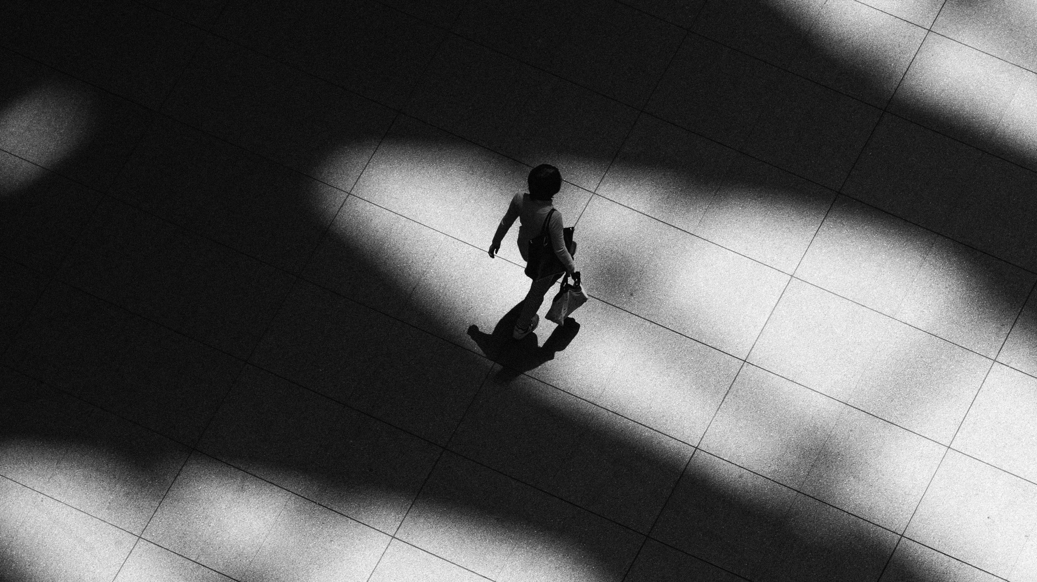
氣 (Ki) — Sensing the Invisible
The character 氣 (Ki) refers to energy, spirit, or atmosphere.
It is a concept deeply rooted in East Asian philosophy, often described as the invisible life force that flows through people, objects, and spaces.
In Japanese aesthetics, 氣 (Ki) is not associated with loudness or dramatic movement. Rather, it refers to a subtle presence—a quiet, felt energy that can be sensed even in the absence of words or action. It is the stillness in a room, the unspoken feeling between individuals, or the atmosphere that envelops a moment.
This presence can be felt in a well-composed tea room, where every element contributes to a sense of quiet focus. It is visible in the stillness of a Noh actor, whose posture alone conveys strength and intention. Even a bonsai tree—shaped over years with patience and care—embodies a quiet energy that feels alive in its stillness.
In daily life, this awareness manifests in the way people interact. In Japanese culture, there is a common expression: "reading the air" (空気を読む). It refers to sensing what is unspoken, being attuned to the emotional atmosphere, and responding with subtle understanding. This reflects a way of moving through the world with attentiveness—not only to others, but also to the surrounding environment.
氣 (Ki) reminds us that beauty is not solely about outward appearance.
It also lies in how something feels, how it fits within its context, and how it quietly influences those who encounter it.
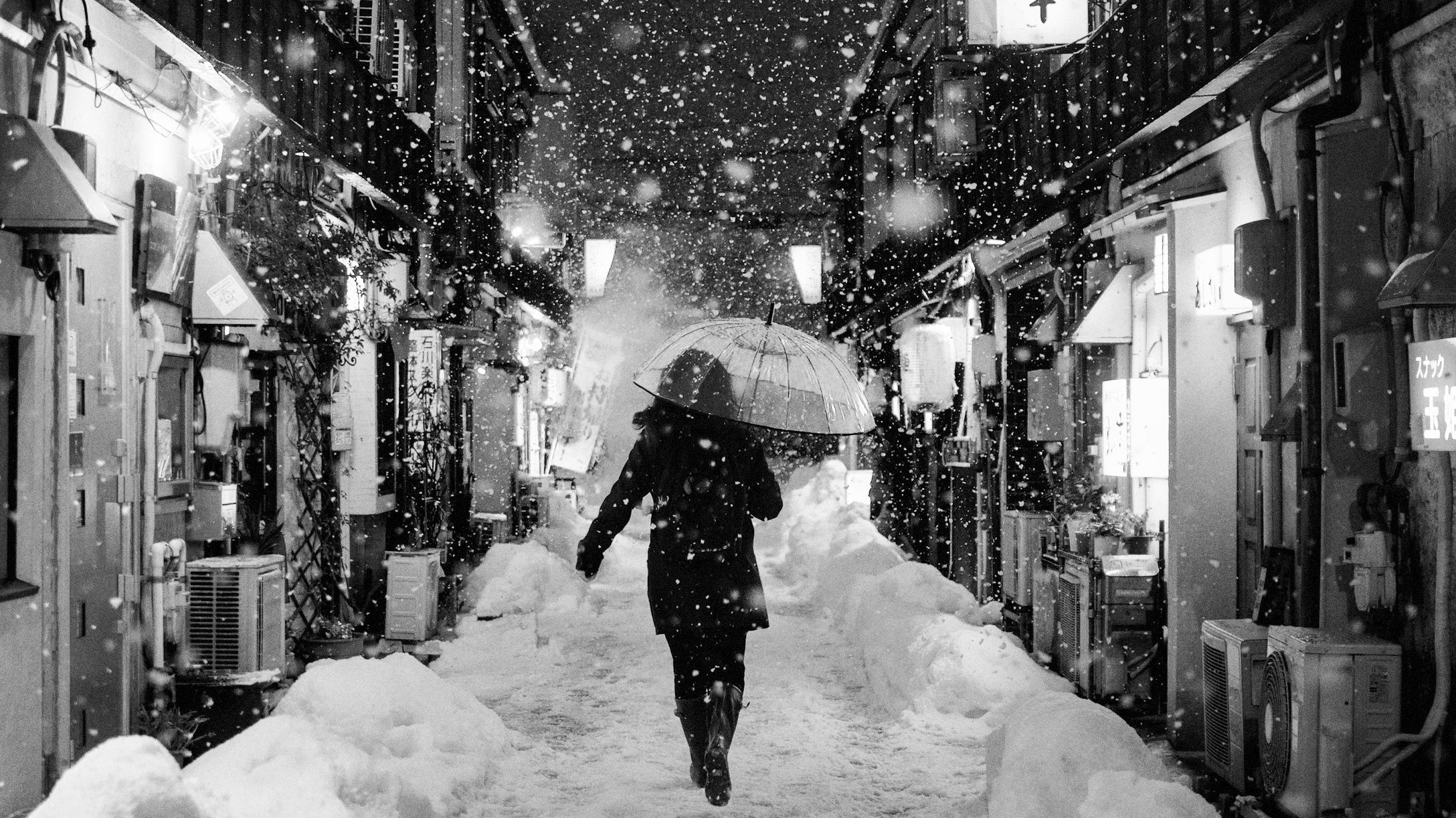
間 (Ma) — The Space Between Things
The concept of 間 (Ma) may already be familiar to some readers. This distinctive idea is deeply embedded in Japanese culture and appears even more frequently than Wabi Sabi (侘寂).
The character 間 (Ma) is often translated as "space," "gap," or "pause."
However, in Japanese aesthetics, 間 (Ma) refers to more than mere emptiness. It is the meaningful interval between things—what gives structure, rhythm, and emotional resonance to the world around us.
Masayuki Kurokawa suggests that when we observe people or objects only from a broad or distant perspective, it becomes impossible to truly perceive the essence of 間 (Ma). The heart of 間 (Ma) lies in subtle relationships, and that sensitivity begins with Bi, the aesthetic consciousness of subtlety. In other words, the path to understanding 間 (Ma) begins by noticing small details.
For example, we can perceive the space between people only after we first recognize the individuals themselves. Likewise, it is only when a single, distinct note exists that we become aware of the pause or nuance between that note and the next. When we view things solely through a collective or generalized lens, 間 (Ma) tends to disappear. In fact, Kurokawa even suggests that the idea of a singular, unified whole ought not to exist at all.
At its core, 間 (Ma) is about recognizing the value of emptiness.
It teaches us that not everything must be filled, explained, or revealed. Sometimes, it is in what remains unspoken—or unfilled—that the deepest meaning resides.
秘 (Hi) — Seeing Without Seeing
The character 秘 (Hi) means "secret" or "hidden."
In Japanese aesthetics, 秘 (Hi) refers to the deliberate act of concealing part of something in order to spark the viewer’s imagination and creative engagement.
Rather than revealing everything openly, 秘 (Hi) embraces mystery, suggestion, and subtlety. It creates space not only for interpretation but for personal participation.
Masayuki Kurokawa explains that hiding part of a work is not about withholding—it is an invitation. The creator does not expect the viewer to see the work exactly as they do. Instead, they hope the viewer will bring their own thoughts, feelings, and experiences, thereby becoming part of the creative process.
In this way, Japanese aesthetics do not always strive for precise communication. There is no single, definitive interpretation. Instead, there is a quiet belief that something in the viewer’s heart will naturally resonate with the artist’s intention. The artwork becomes complete through this shared experience—through presence, imagination, and mutual sensitivity.
A notable example of 秘 (Hi) can be found in Hasegawa Tōhaku’s Pine Trees screen painting. Much of the screen is left intentionally blank, allowing the viewer’s eyes and mind to wander into the mist. This emptiness and gentle concealment express both 間 (Ma) and 秘 (Hi), inviting each person into a personal, contemplative encounter with the work.
Ultimately, 秘 (Hi) reflects a soft voice from the artist to the viewer: Be yourself. Understand this work in your own way.
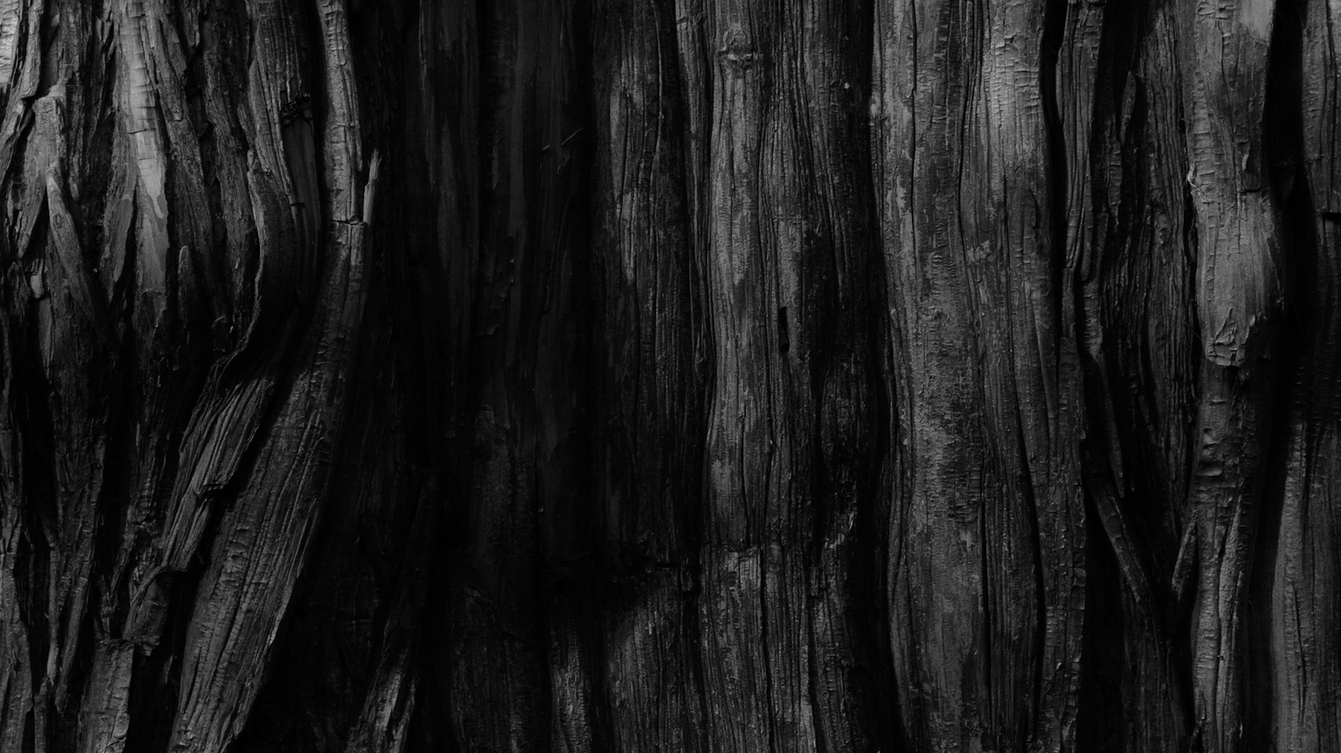
素 (So) — The Essence of the Unadorned
The character 素 (So) means "plain," "unadorned," or "raw."
In Japanese aesthetics, it reflects the idea that the most beautiful things are those preserved in their natural state. Ideally, nothing unnecessary is added; instead, each element exists as part of a larger, balanced, and harmonious whole.
Masayuki Kurokawa explains that the Japanese tend to experience the world through their senses rather than through thought alone. What matters most is how to reveal the inherent qualities of a material. The question is not how to decorate something, but how to allow its essence to quietly emerge. This principle forms the foundation of Japanese design—to let materials express their vitality through simple, honest forms.
Japanese aesthetics are often associated with minimalism, yet minimalism is not the goal. It is the natural result of respecting the material and removing what is unnecessary. Simplicity is not a style; it is the outcome of intention and restraint.
Consider the kimono, for example. Its shape remains largely unchanged—consistent and understated. Yet the diversity arises from the fabric, the weave, and the subtle interplay of color. The beauty lies not in the form itself, but in the richness of the material.
This is why the notion that "Japanese people just like minimalism" fails to capture the full picture. The simplicity in Japanese design comes from a profound respect for materials and a reluctance to impose excessive creativity or display technical prowess. Instead, it reflects an appreciation for what is honest, quiet, and essential.
Kurokawa reminds us that 素 (So) is not merely about appearance.
It is about revealing what lies at the core. It is the texture of raw linen, the grain of unfinished wood—the quiet presence of something with nothing to prove.
In a world saturated with branding, decoration, and noise, 素 (So) returns us to the essence. It invites us to value things—and people—not for how they perform or present, but for what they truly are.
This is also why Japanese product design remains so influential. It has never strayed from this core aesthetic: a deep respect for material, for simplicity, and for authenticity.
This is the spirit of 素 (So).
仮 (Ka) — Beauty in the Made
When we think of beauty, we often imagine what is original, natural, or untouched. However, in Japanese aesthetics, beauty can also be found in what is artificial, temporary, or imitative. This idea is embodied in the concept of 仮 (Ka).
The word 仮 (Ka) can mean "imitation," "temporary," or "artificial." While these terms may initially seem negative—as if suggesting something false or inauthentic—in Japanese culture, 仮 (Ka) conveys something more nuanced. It refers to beauty that is intentionally constructed or recreated with care and meaning.
In this sense, imitation is not merely copying. It is a way of engaging with tradition—of honoring the past while creating something new. To imitate well is to reinterpret, to renew, and to give old forms new life.
This sensibility is eloquently expressed in Kintsugi, the art of repairing broken pottery with gold. Rather than concealing the cracks, Kintsugi highlights them. The break becomes part of the object’s story. The piece is not restored to what it once was—it is transformed into something even more meaningful.
We also see this idea reflected in architecture and the natural environment—in weathered wood, aged plaster, or stone paths shaped by time. These are not untouched natural forms, nor are they purely artificial. They are shaped by both human intention and the forces of the world—and therein lies their beauty.
At its core, 仮 (Ka) expresses the idea of impermanence: that nothing lasts forever. This belief, rooted in Buddhism, encourages acceptance of change and the discovery of grace within what is transitory, incomplete, or rebuilt.
Closely related to Wabi Sabi (侘寂), which values imperfection and age, 仮 (Ka) reminds us that authenticity is not limited to what is pure or original.
It also resides in what is built, repaired, and lovingly reimagined.
破 (Ha) — Breaking to Become
The character 破 (Ha) means "to break," "to tear apart," or "to disrupt."
In Japanese aesthetics, it signifies the moment when an established form is intentionally broken—not as an act of rebellion, but as a way to transcend tradition and create something new.
This idea is grounded in the belief that one can only break a form meaningfully after fully understanding it. In other words, tradition must first be studied and mastered. Only then can it be challenged and transformed with integrity.
We see this principle embodied in the work of Katsushika Hokusai, who reimagined classical painting through the dynamic language of ukiyo-e prints. It is also present in Issey Miyake’s fashion designs, where folded, sculptural garments defied conventional forms of clothing—yet remained deeply rooted in Japanese sensibilities.
Masayuki Kurokawa described 破 (Ha) not as destruction, but as creative energy. It is the force that breaks through limits and reshapes inherited structures in a way that resonates with the present.
Importantly, 破 (Ha) does not reject tradition—it builds upon it.
Only by respecting and internalizing a form can one break it in a way that honors its spirit while propelling it forward.
In a culture that often values harmony and continuity, 破 (Ha) provides a necessary counterbalance. It reminds us that true creativity may involve breaking the rules—and that beauty can emerge not only in stillness, but also in boldness, tension, and change.
Read More Design Articles:
• Kintsugi: Finding Beauty in the Art of Repair
• Ikebana: The Art of Japanese Flower Arrangements
• What is Wabi Sabi? Embracing the Beauty of Imperfection
• Ma: The Japanese Aesthetic of Negative Space and Time
About Us
Dans Le Gris is a brand that began with everyday jewelry, with each handmade piece designed and crafted in Taiwan. We deeply value every detail, dedicating ourselves to creating timeless pieces through collaboration with experienced craftsmen.
In our journal, we provide irregular updates featuring articles about art, culture, and design. Our curated content encompasses diverse aspects of life, with the aspiration to offer meaningful insights and inspiration.
Shop Now
↪ Follow us for more updates: YouTube | Instagram