Why does japanese design feel so different, even when it looks simple? Japanese design is not just about minimalism. It reflects a deeper way of seeing that values space, silence, seasonality, and emotional subtlety.
In this article, we explore five quiet principles that shape the emotional experience of Japanese design. They are often overlooked, but once you begin to notice them, you will start to feel their presence everywhere—in architecture, interiors, everyday objects, and the atmosphere of daily life.
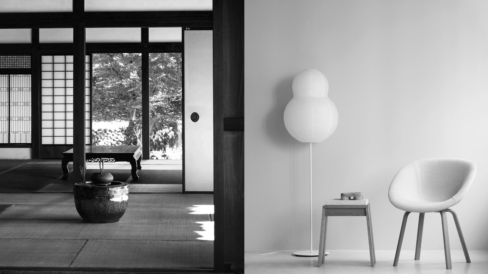
Yohaku no Bi: The Beauty of White Space in Japanese Design

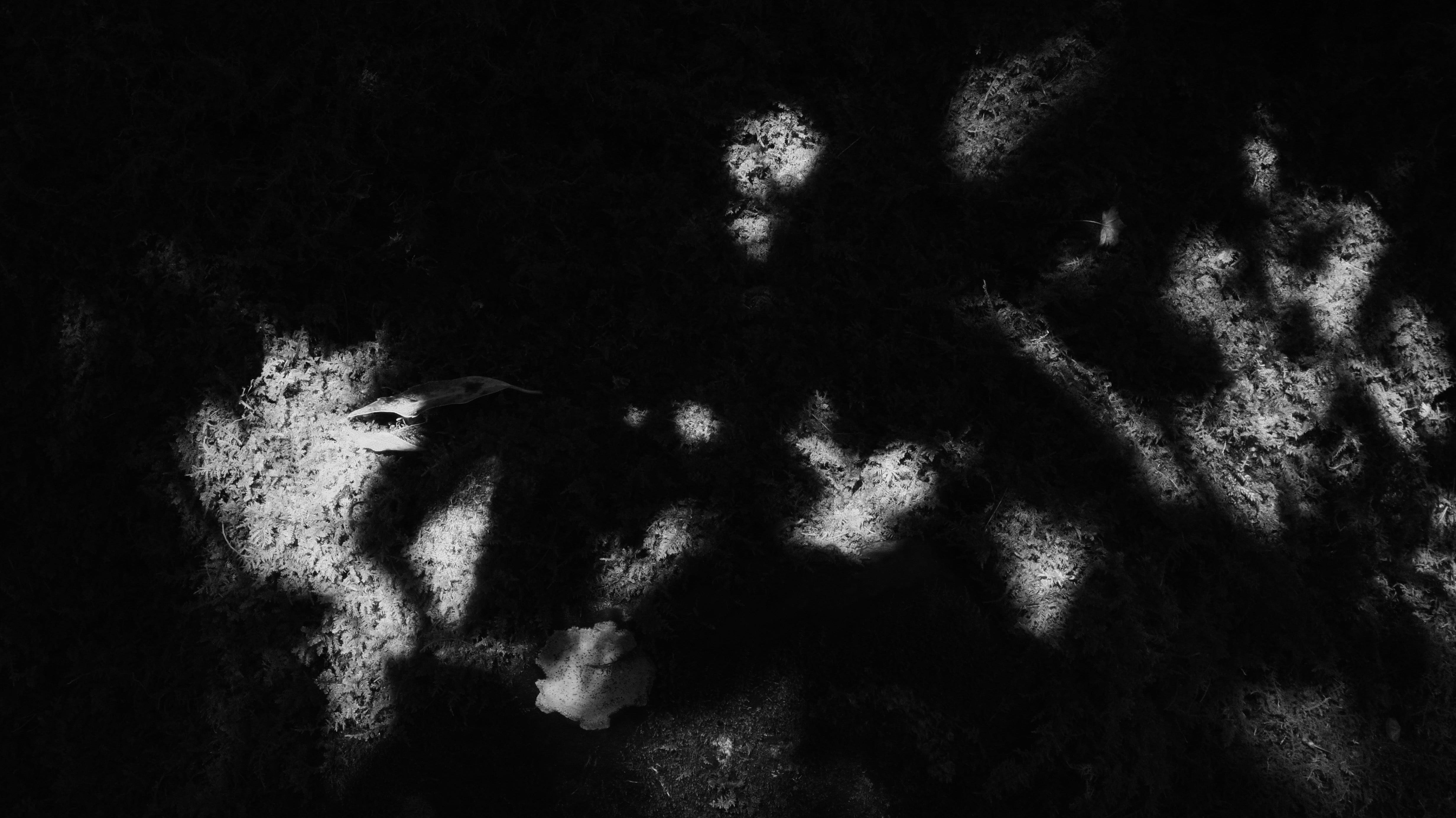
Have you ever felt calm just by looking at a quiet, uncluttered space? That sense of peace might come from something the Japanese call Yohaku no Bi(余白の美), which means the beauty of white space.
But this idea goes beyond minimalism. It is about allowing space to speak, recognizing that what is not shown can be just as powerful as what is.
In Japanese design, emptiness is not a lack. It is a presence.
At first glance, Yohaku no Bi(余白の美) and Ma(間) may seem similar. Both involve space, silence, and what is left unsaid. But they reflect different sensibilities.
Ma(間) refers to intervals, the pauses between elements. These can be spatial or temporal, like the silence between musical notes or the stillness between movements.
Yohaku no Bi(余白の美), on the other hand, is about visual and physical emptiness. It often appears in two-dimensional works like ink paintings, calligraphy, or graphic design. Picture a single brushstroke floating in a sea of white. That white is not just background. It is part of the message.
This is not merely about removing clutter. It is about recognizing emptiness as meaningful, as space created with intention. It is a place that invites imagination, reflection, and possibility.
We see this beautifully in the work of designer Kenya Hara, one of Japan’s most influential contemporary graphic designers. His compositions often use white as the central element, not as a backdrop but as a voice.
Hara once said that white is more than just a color. It is a starting point. A blank slate. When we let go of assumptions and return to white, we return to a place of potential. In this way, white becomes more than empty. It becomes open. It suggests what is yet to come.
Like an empty vessel, blank space may appear to hold nothing. But it carries a quiet expectation. It creates room for the viewer to engage, interpret, and feel.
This is the essence of Yohaku no Bi(余白の美). A beauty not created by adding more, but by leaving space for something deeper to emerge.
Shakkei: The Japanese Art of Borrowed Scenery

In Japanese design, beauty does not always need to be created from scratch. Sometimes, it is enough to recognize what is already there.
Shakkei(借景) means borrowed scenery. It is a technique where the natural landscape beyond a space becomes part of the design itself.
You often see it in traditional Japanese gardens. A distant mountain, a line of trees, or the open sky is carefully framed through a window, a gate, or an opening in the wall.
But shakkei(借景) is more than just a visual technique. It is a philosophy of harmony. It softens the boundary between inside and outside, between what is man-made and what is natural.
In Japanese aesthetics, this merging reflects a quiet respect for the world beyond our control. Rather than trying to dominate the environment, shakkei(借景) welcomes it in.
We see this concept in modern design as well. In architecture, windows are often placed to capture a view—not to impress, but to create a moment of stillness.
In crowded cities where there is little space for a garden, shakkei(借景) offers a meaningful alternative. By framing the scenery that already exists, such as a nearby park, a row of trees, or seasonal cherry blossoms, even a simple window can become a living painting.
Even indoors, a well-placed mirror or screen can reflect light or greenery from outside. In doing so, it draws the natural world into the room and gently shifts the atmosphere.
Shakkei(借景) reminds us that beauty is not always something we need to invent. Often, it is already around us. All we need to do is notice it and make space for it.
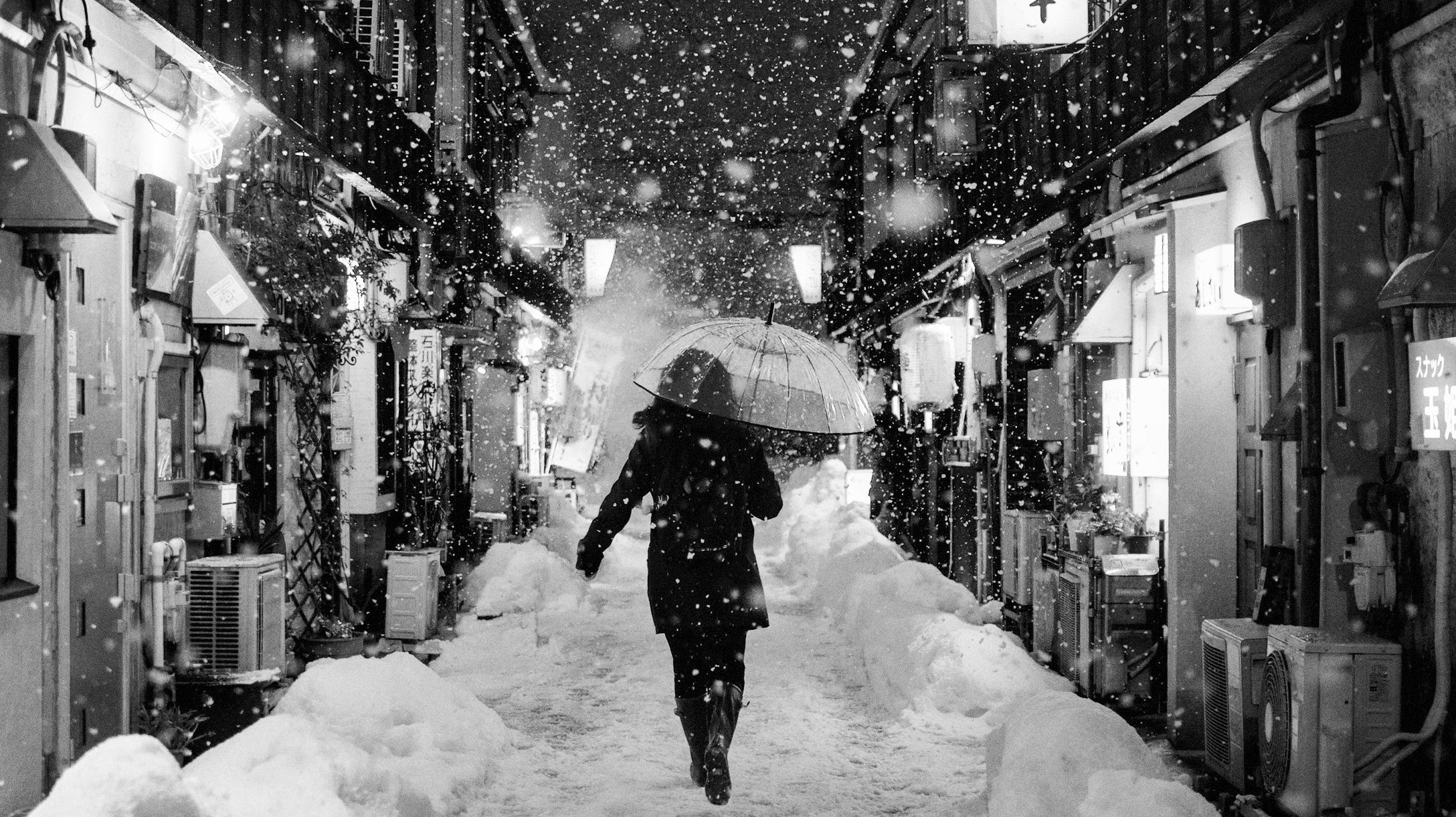
Iki: The Effortless Elegance of Japanese Aesthetics
Some forms of beauty shout. But some just whisper.
Iki(粋) is a kind of elegance that feels effortless. It is simple, refined, and deeply personal. Never flashy. Never overdone.
Iki(粋) is a uniquely Japanese aesthetic that began in Edo, the city we now call Tokyo. It described a sense of stylishness among city dwellers, not based on wealth or status but on taste and attitude.
At its heart, Iki(粋) is about spirit. People in Edo admired those who expressed grace through subtle gestures and quiet confidence.
Refinement did not come from lavish decoration. It came from how one carried themselves. In this way, Iki(粋) shares something with minimalism. But it is not minimalism by rule. It is minimalism in spirit.
Iki(粋) values inner beauty more than outward display. It is often compared to elegance, chic, or even soul, but none of these fully capture what it means.
In design, Iki (粋) reveals itself through quiet and thoughtful choices—honest materials, balanced proportions, and subtle finishes. Nothing feels too perfect or overly polished. The beauty is understated, but those with a discerning eye will recognize its quiet charm.
Even today, Iki(粋) lives on in Japanese design and culture. You can see it in fashion, interior spaces, and the quiet attention to seasonal details. For example, someone might wear just one subtle color that reflects the season or add a hidden detail that only a few will notice.
These quiet choices express Iki(粋), a kind of beauty that whispers rather than shouts.
Shitsurai: The Japanese Art of Preparing Space with Meaning
In Japanese culture, the way we prepare a space is just as important as the space itself. This idea is expressed through Shitsurai(室礼), the practice of arranging objects with care and meaning.
Rooted in court rituals and seasonal traditions, Shitsurai(室礼) has quietly become part of daily life in Japan. You can see it in homes, tea rooms, and even in modern interiors.
It often takes shape in the placement of calligraphy, flowers, or meaningful objects in alcoves, entryways, on walls, or along shelves. These arrangements reflect the changing seasons or mark special moments in life.
Each item is chosen with intention—not to impress, but to welcome. To create a space where beauty is not only seen, but felt.
At the heart of Shitsurai(室礼) is thoughtfulness. It is a quiet gesture of care and respect for others.
For example, placing seasonal flowers or meaningful objects before a guest arrives is a gentle way to express welcome and warmth. This tradition, passed down through clothing, food, and shelter, reminds us that human life exists in harmony with nature.
Shitsurai(室礼) is deeply connected to presence and awareness. It reflects sensitivity to time, season, and occasion.
Even in modern design, this spirit continues. You can feel it in the careful placement of objects, the soft transitions between materials, and the gentle flow of natural light.
All of these are expressions of Shitsurai(室礼)—acts of quiet respect for nature, for others, and for ourselves through the arrangement of space.
Shitsurai(室礼) invites us to feel the seasons and to live with gentle attention to the world around us.
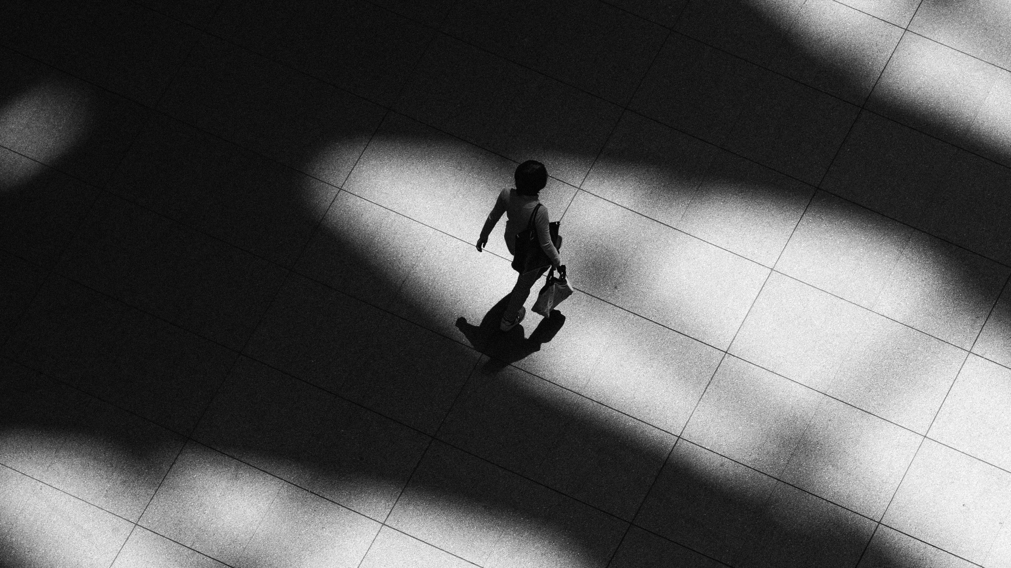
Yoin: The Japanese Aesthetic of Lingering Emotion
Some moments pass, but they do not truly end. They leave something behind.
In Japanese aesthetics, this lingering feeling is called Yoin(余韻). It means resonance, the sense that something continues to echo even after it has ended.
Yoin(余韻) refers not only to sound but also to the emotional impression that remains in the heart. A quiet atmosphere. A memory that slowly unfolds.
It is sometimes compared to Yūgen(幽玄), the idea of hidden and mysterious depth. But while Yūgen(幽玄) draws us into the beauty of the moment, Yoin(余韻) begins after the moment has passed. It stays with you, quietly and without effort.
Japanese art often carries this sense of Yoin(余韻). It does not explain everything. It leaves space for you to feel something on your own.
You might sense it after leaving a tea room where every object was placed with care. Or when you notice a single flower in an empty space. Or while walking through a garden where the stillness allows every detail to gently unfold.
In Japanese design, Yoin(余韻) is the emotional shadow. It reflects a kind of beauty that leaves space for feeling, memory, and imagination.
Japanese aesthetics often value the unfinished, the unspoken, and the imperfect. Not everything needs to be explained. Not everything needs to be complete.
Yoin(余韻) is beauty that lingers, long after the moment has passed.
Read More Design Articles:
• 7 Japanese Zen Aesthetic Principles That Define Wabi Sabi
• How Japanese Everyday Objects Reflect Beauty and Craftsmanship
• 8 Japanese Aesthetics That Might Change How You See Beauty
• Ma: The Japanese Aesthetic of Negative Space and Time
↪ Follow us for more updates: YouTube | Instagram