When you think of summer, what colors come to mind? Perhaps the fresh green of young leaves, the soft blue of morning skies, or the golden glow of fireflies at night.
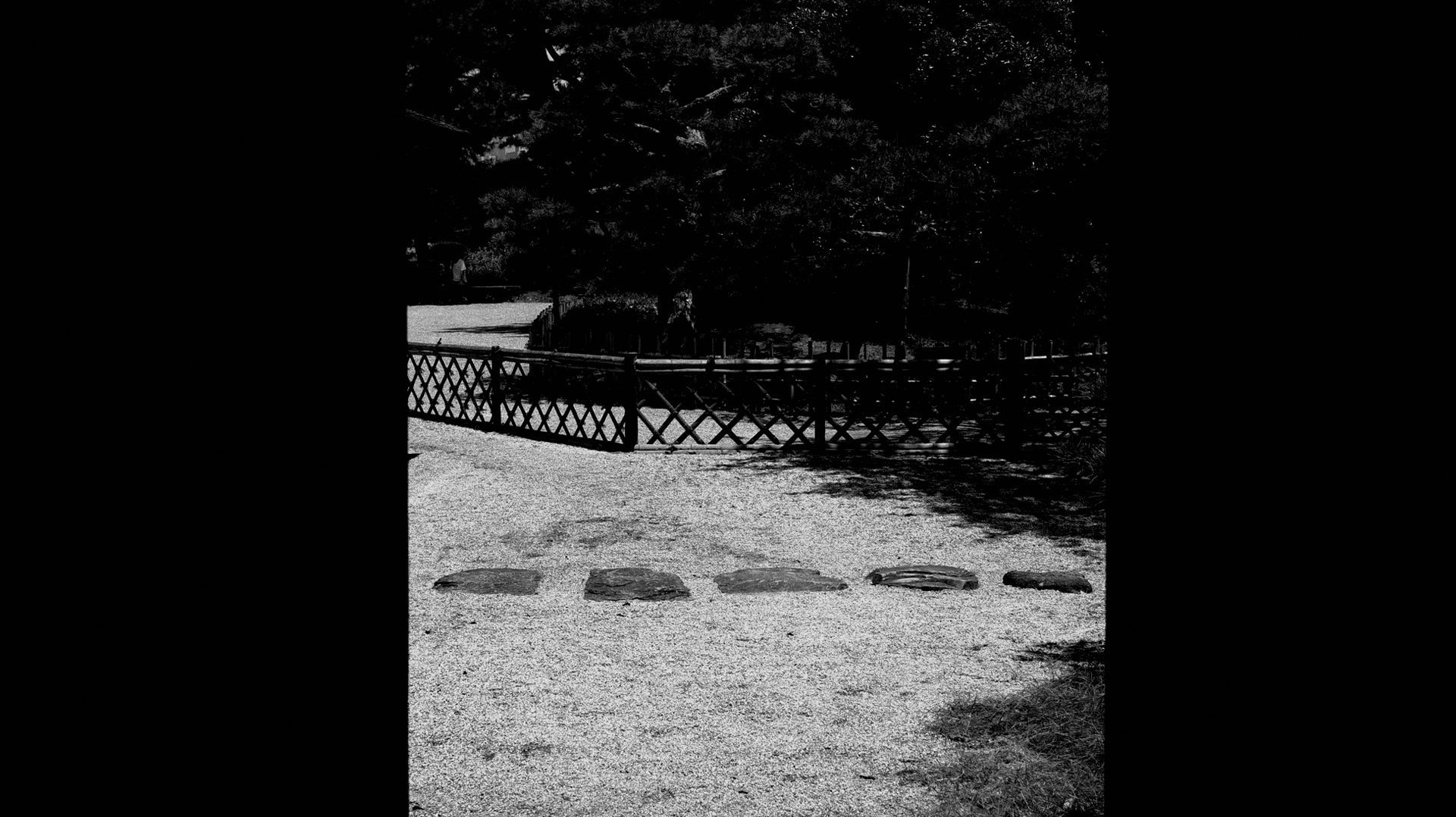
In Japan, each season is more than a change in weather. It is a shift in atmosphere, mood, and the way beauty is experienced. This awareness shapes not only art and design but also the textures we touch, the flavors we enjoy, and the colors that surround us.
Many of these hues come from traditional Japanese palettes that have been named and cherished for centuries. Today, let’s explore some of these summer colors and their hidden meanings.
The Meaning of Kisetsukan and Japanese Seasonal Colors
What if a single word could capture the feeling of an entire season? In Japan, that word is kisetsukan(季節感)—the sensitivity to the changing rhythms of nature. It is not only about noticing the weather but about sensing the atmosphere of each time of year, and how the seasons are reflected in daily life, culture, and emotion.
This awareness is expressed in countless ways in Japanese aesthetics. In poetry, painting, design, and architecture, the presence of the seasons is almost always felt.
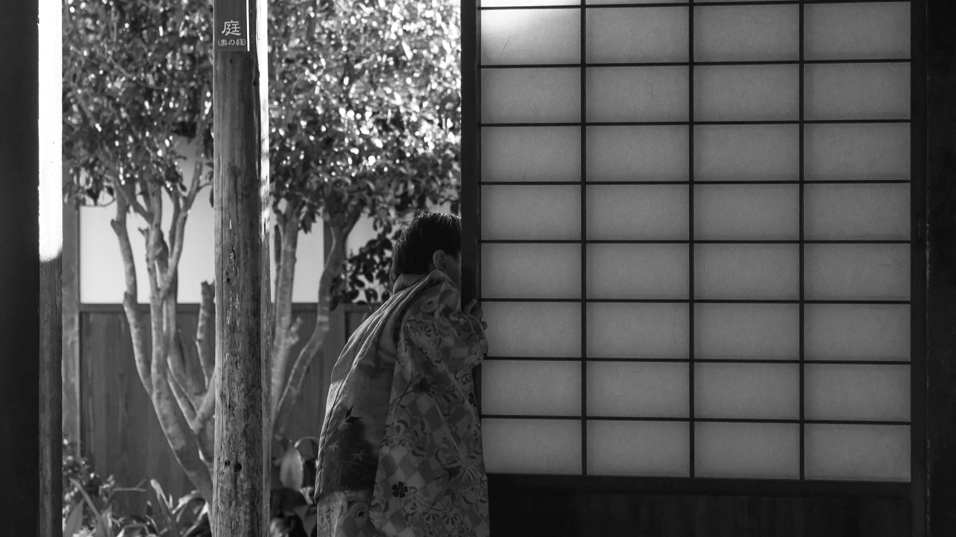
Perhaps the strongest expression of the seasons comes through color. In early summer, vivid greens brighten fields and gardens, symbolizing freshness and renewal. Later in the season, indigo and soft blues take over—shades long used in summer textiles to bring a sense of coolness to the heat.
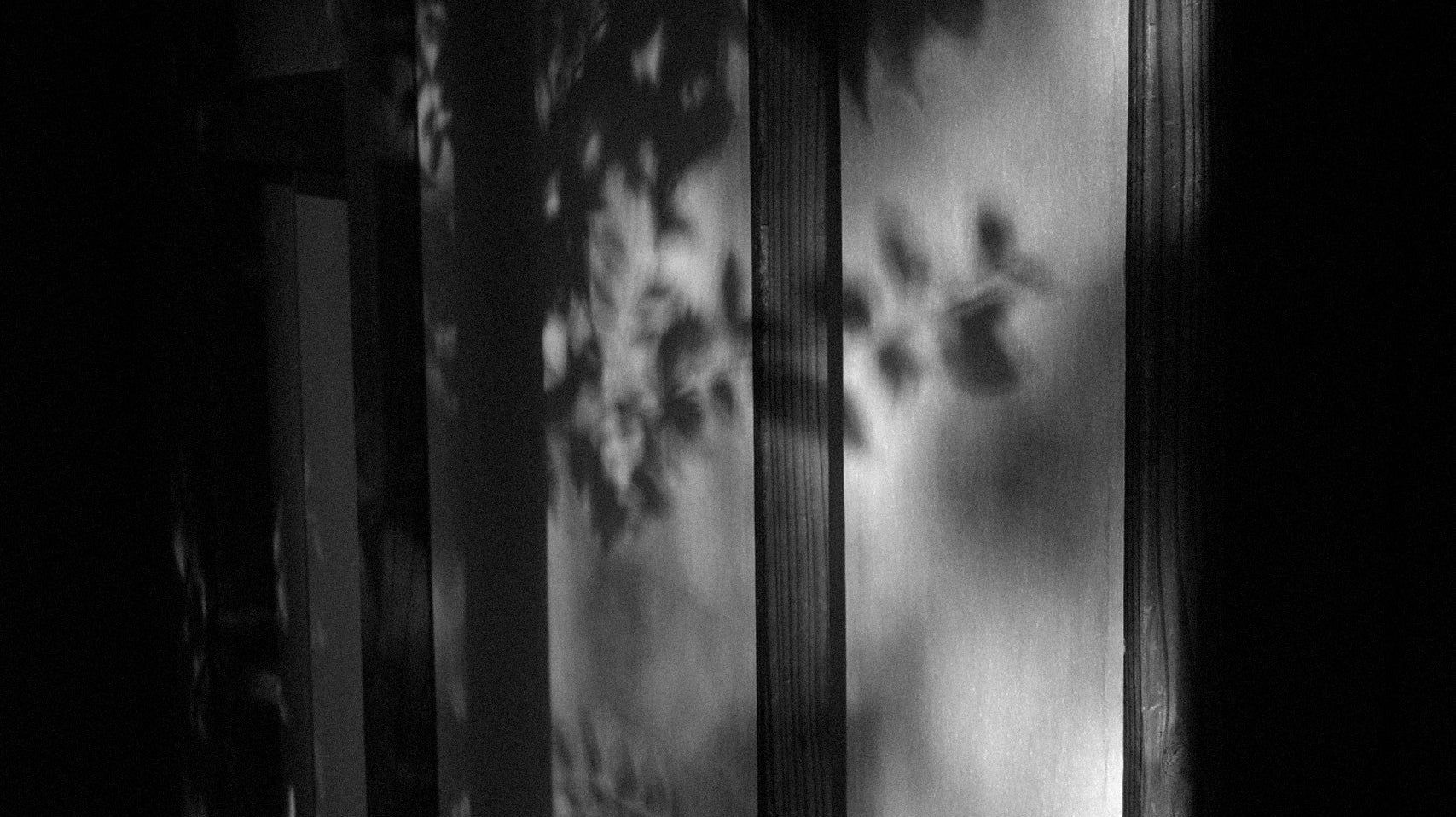
Colors shape not only clothing but also art and craft. In kimono, seasonal shades are chosen with care: spring brings soft tones of pink and green, while autumn appears in deep reds and golds. Even the patterns on shoji paper and folding screens often feature seasonal flowers and landscapes.
By noticing these subtle changes, Japanese aesthetics encourage us to remain connected with the rhythms of nature. This sensitivity is what gives Japanese colors their quiet, emotional depth.
The Colors of Japanese Summer and Their Meanings
What images or feelings do summer colors bring to mind?
In Japan, the colors of summer are closely tied to nature. It is not only the vivid hues that shine under the midsummer sun, but also the cooler and more refreshing tones that bring relief from the heat. Within the same season, the impression can shift between warmth and coolness, and both are equally part of the summer atmosphere.
The season begins with fresh greens in rice fields and young leaves. These shades symbolize renewal and growth. A traditional color is wakakusa-iro(若草色), the bright yellow-green of young grass sprouting from the spring soil. Because the grass grows quickly under the sun, this moment is fleeting, giving the color an ephemeral quality.

As summer advances, the focus turns to flowers blooming under the strong light. Morning glories, cherished as a seasonal symbol, appear in vivid blue and purple as well as pink and white, each hue capturing the brilliance of the season.
Later, the palette shifts toward cooler tones. Mizuasagi(水浅葱), a pale blue with a touch of green created through indigo dyeing, recalls the clear water of mountain streams. Ai-iro, or indigo blue, was widely used in summer textiles, valued for both its beauty and its cooling effect. These blues even appeared in advertisements to suggest freshness and relief from the heat.

As evening falls, summer colors take on a softer glow. Fireflies light up the night with a gentle yellow-green against a deep indigo sky, creating one of the most nostalgic images of Japanese summer.
Each of these colors carries cultural meaning as well as beauty. Like the firefly’s brief glow, they remind us how fleeting and precious the moments of summer can be.
Traditional Color Palettes in Japanese Art and Design
These colors did not simply appear from imagination. Many are drawn from traditional Japanese palettes that were named centuries ago. Inspired by nature, poetry, and the fabrics people wore, they gradually became part of daily life.
During the Taishō and Shōwa eras, dictionaries of Japanese colors were published to preserve these shades. They carefully recorded the tones used in kimono, crafts, and seasonal celebrations. What stands out is the attention given to matching colors with the rhythm of the seasons. Choosing the right shade for summer or autumn was not only a matter of taste but also a way of living in harmony with nature.
Indigo dyeing shows this especially well. Indigo created beautiful blues, but it was also believed to repel insects and bring a cooling effect in the heat. In ukiyo-e woodblock prints, artists often used indigo and white to suggest coolness, rivers, or night skies.
Green was just as indispensable in depicting summer scenery. It represented trees, flowers, and rural landscapes across countless seasonal scenes. Rather than relying on a single shade, artists used many tones of green to create depth and atmosphere. The subtle differences between fresh leaf green, deep green, and yellow-green allowed summer landscapes to feel vivid, alive, and at the same time quietly refreshing.
These traditions show that color was never just surface. It became a cultural language that continues to shape the way we design and experience beauty today. At the same time, these colors remain a way of noticing the world differently—a language of feeling that connects us with nature and with time itself.
Download the Guide to Japanese Summer Colors

If you would like to keep these palettes close, I have created a digital mini-book that gathers selected summer color palettes, cultural notes, and ready-to-use HEX codes. It is a guide you can return to whenever you wish to bring the feeling of Japanese summer into your own work or daily life.